Friday 28 November 2014

Deep Sequencing: TITLE REDACTED

Or Jonathan Hickman and the best damn author bio gag in comics 


I think book design in comics is really important. I think it is important because I view books as art objects. I mean, my love for comics is mostly about the stories contained in the pages, but they are also things I arrange on shelves and decorate my home with.  I really appreciate it when attention is given to book design and when it is done well. I also think book design is really important for selling comics: books that are pretty or better yet, distinctive are more likely to catch the consumers eye. (I particularly think comic spine design is under-utilized) And the thing is, book design in comics is frequently middling at best.

Jonathan Hickman and his collaborators are excellent at book design. HickmanEtc books have compelling and interesting covers, wonderful use of buffer spaces between chapters, and a distinctive, unique spine design. They even have a distinct visual identity that makes every HickmanEtc comic instantly recognizable as a HickmanEtc comic. And with it's creepy photo cover, black minimalist cover, and black and grey spine stripes, Secret is another boldly Hickmanian looking book. 

It also has the greatest author bio page in all of comics.


Jonathon Hickman's bio is always pretty amusing. It has mostly followed a formula where it mentions some of his accomplishments, tells an amusing lie about his twin brother, and then jokingly threatens to leave his family if he isn't showered with affection. It's short, punchy, funny, and always a little different. It is the one author bio I always makes sure to read in comics. In Secret, a comic about espionage and lies and, well, secrets, the familiar Hickman bio, and the bio of artist Ryan Bodenheim re heavily redacted. Which is just such a clever thing to do.

I absolutely love it.

You can all go home now, Hickman and Bodenheim have won bio pages.

Wednesday 26 November 2014

So I read Secret

A 250 word (or less) review of Secret,
by Jonathan Hickman, Ryan Bodenheim, Michael Garland, Rus Wooton; Image Comics


Secret is an espionage thriller comic about Grant Miller, an agent of the private security firm Steadfast, as an abduction and a murder in London send him on a collision course with a gigantic, dirty secret. Overall I’d say Secret is quite a good comic. The plot is pleasantly dark and enigmatic and action packed, key moments are intense and brutal, and the art is oddly perception skewing. It certainly feels like a comic meant to deliver a subversive, truth warping story which managed to evoke a queasy sense of paranoia while reading it. Secret is also a very concise comic which delivers a well-realized, taught narrative with a lot of skill in a small space. As much as I enjoyed Secret, I can't shake the feeling that the comic could have been even better than it was. While Secret is certainly a very good comic, I can't help but feel that Hickman, the writer of the labyrinthine and slippery The Nightly News, is capable of a much more convoluted and devious comic than Secret turned out to be. Secret was originally billed as an ongoing, and I  wonder how the story might have turned out were it given more room to breathe and develop. Regardless, secret reads as a smart thriller comic with a few really intense and remarkable moments and is worth obtaining by any means necessary. But if you steal it, Don't. Get. Caught.


Word count: 237

Monday 24 November 2014

Marvelling At Captain Marvel #9

Or a rhyming plot map of Captain Marvel #9
by Kelly Sue DeConnick, David Lopez, Lee Loughridge, Joe Caramagna; Marvel Comics


Captain Marvel #9 is the Shakespearian rhyming Rock Opera we all want and sometimes deserve! It is wicked good fun. And since I really want to talk about this comic and have nothing substantial to say besides "gee it rhymes", I decided to tackle Captain Marvel #9 by trying to make a rhyming plot map for the comic. 

This being a plot map (of sorts) it will contain *SPOILERS*. So take head lest I become a goodtimes foiler. 


Some quick things: I love the audacious rhyme of "Builder War" with "Carol Corps". It's fun that there is now an in canon pronunciation guide for the Carol Corps. Also, it's pretty interesting that the Shakesperian Rock Opera of CM#9 is basically a gender swapped fairy tale, with the royal to be wed against their wishes being the son. It's another fun choice. 

This issue was a riot and is just kind of exactly what I want from a mainstream superhero comic: it's well made and super fun!

(And to everyone I know out there who is "too good" for super hero comics, look, you just totally missed out on a rhyming rock opera comic that is wicked good.)

Post by Michael Bround

Previously
Marvelling at Captain Marvel #4: Joyous collaboration.

Marvelling at Captain Marvel #3: When joke and story telling collide
Marvelling at Captain Marvel 17: A meta-fandom salute
Marvelling at Captain Marvel 15-16: On tie ins
Marvelling At Captain Marvel #13-14: On The Enemy Within
Marvelling At Captain Marvel #12: Demarcating reality and fantasy
Marvelling At Captain Marvel #10: A dramatic contract
Marvelling At Captain Marvel #9: How your brain tells time
Marvelling At Captain Marvel #7: Saving a reporter in distress... AND ITS A MAN!
Marvelling At Captain Marvel #1: An alternate reading order that I liked more

Friday 21 November 2014

Deep Sequencing: By Kiss or Proximity

Or an examination of smooching in By Chance Or Providence
By Becky Cloonan.


When you follow too many comics people on twitter, you end being a huge snoop on some pretty interesting conversations. Which you know, makes you feel like an eavesdropping creep, but can also deliver some interesting tidbits about the comics industry or comics craft. And this entire post is predicated on seeing a conversation between creators.

Specifically, I "overheard" Kieron Gillen complimenting Beck Cloonan on her skills at drawing people kissing (or specifically that he wanted Cloonan to art-direct his own smooches). To which Becky Cloonan replied that "it's the "almost kiss" that is the most important part to draw". Which I thought was an instructive and interesting point worth exploring. And I realized that I recently read By Chance Or Providence and that there was a lot of pretty intense smooching in that comic and that I remember all of it being really well drawn.

And then I thought, that By Chance Or Providence is the comic with maybe the most passionate kissing I could think of.

So I went looking for images depicting people actually kissing and panels depicting the moment just before (or just after) to essentially explore the difference between the two shots and to test Becky Cloonan's theory about drawing kisses using her own artwork.


And I found something surprising.

There are almost no panels of people actually kissing in that comic.

Instead there are panels depicting people "almost" kissing, that are these perfect depictions of yearning and passion and which create the emotional feeling of kissing.

And that it is these "almost kiss" panels that make me remember a comic that has a lot more passion and smooching than comics that depict more actual kisses. Actually, the "almost kiss" panels are so well done that I actually remember there being more passion than is directly portrayed in the comic. It is really, really effective stuff.

So, I guess the Cloonan Theory of Smooching holds up to scrutiny.

And you should definitely read By Chance or Providence.

Post by Michael Bround

Wednesday 19 November 2014

So I Read By Chance Or Providence

A 250 word (or less) review of By Chance or Providence
by Becky Cloonan;


By Chance or Providence is a book collecting the independent comics of Becky Cloonan. Specifically, the book collects critically acclaimed comics Wolves, The Mire, and Demeter in a beautiful hardcover edition. While each comic stands alone, they all share common thematic elements of supernatural horror stemming from forbidden romance and are all set in medieval-ly Europe. In Wolves we see the story of an exiled werewolf hunter, in The Mire a squire is sent with an important message to a haunted swamp, and Demeter sees a young woman with a fear of the sea and a secret, fear for her lover. For me, the appeal of the comics collected in By Chance or Providence is that they are triumphs of storytelling. While the overall plot of each chapter is somewhat familiar, each story is delivered with such skill and nuance that every chapter is a remarkably satisfying read. Becky Cloonan has long been a favourite artist of mine, but these comics really highlight her skills both as a sequential storyteller and as a really gifted writer. By Chance or Providence is also pretty neat in that the comic feels like that special home project of a master craftsmen, like the gorgeous guitar a luthier makes for their private use. It's.... really, really great. While By Chance and Providence might be tough to track down, you can still get its constituent chapters digitally through Comixology or in print from Cloonan's store. You owe it to yourself to check this out.

Word count: 249

Monday 17 November 2014

Exposing The Secret Avengers #9

Or a look at kind of a great page or whatever in Secret Avengers #9
by Ales Kot, Michael Walsh, Matt Wilson, and Clayton Cowles; Marvel Comics


Secret Avengers is one goofy and subversive comic book filled with a pleasantly complex plot and some delightfully dark moments. It's also a comic that has some really effective storytelling choices and artwork. And I want to take a closer look at one page from the issue that I thought was full of a bunch of small choices that make for a really interesting and effective page.

There will be *SPOILERS* after this. But you already knew that, right?


I think one of the most interesting challenges with depicting Hawkeye in comics is that ranged weaponry isn't particularly visual. Like, I mean you can draw and archer, an arrow in flight, and a target getting struck, but that isn't particularly interesting after a while. What I like about this page here is that it does a great job capturing the experience of archery in a visually interesting way.

The first thing I like about this page is how it sequesters the experience of firing a bow from the consequences of the arrow. Down one side of the page we have panels focussing on Hawkeye firing arrows, which are tightly cropped and have a universal purple colour and empty background, catching the tranquil space and focus of an archer. On the other side of the page we have the much more chaotic experience of being a target of arrows and being struck by projectiles. It's bow and then it's arrow.

Which is actually an interesting construct of comics because you effectively have three interlocking, simultaneous comic strips on the top half of this page.


You can equally read this page in three different ways. Down the left of the page is a three panel comic strip (red) that only shows Clint firing his arrows one after another. On the right side of the page is another comic strip (blue) showing the wrestler guy getting pummelled with arrows and being knocked over the railing. But you can also read the page left-to-right and top-to-bottom and get a three tiered comic (green) that shows Hawkeye firing his bow, his arrows in flight, and then his arrows striking the target guy. It's pretty cool stuff.

I'm also a big fan of how the arrow flight/ arrow collision is constructed. The transition from flight to impact to reaction is interesting and kind of funny. The fact the construct is used twice, does a great job setting up the grappling hook shot which changes from a left-to-right panel transition to an up-and-down transition, which sells the experience of nabbing something which is falling. Which is such a little thing, but is just super clever. Which is kind of what I love about this comic: it's fun and just filled with neat comics.

Post by Michael Bround

Previously:
Secret Avengers #7: Labyrinthine panelling
Secret Avengers #4: Colour as character symbols.
Secret Avengers #2-3: Smart layouts.


Friday 14 November 2014

Breaking Down Batgirl #35

Or a look at the representations of networked life in Batgirl #35
by Cameron Stewart, Brenden Fletcher, Babs Tarr, Maris Wicks, and Jared K Fletcher; DC Comics


Batgirl seems to be a comic that is very interested in depicting a realistic and relatable version of Barabara Gordon as a 20-something millennial living in a trendy satellite neighbourhood of Gotham. She has stylish roommates who throw rocking parties filled with diverse sexy young adults. People drink, sexy times happen, and hangovers are treated with coffee. There are undercuts, so many undercuts! Slight irony aside, the comic really does a great job portraying an authentic feeling group of young people in a setting that is only mildly TVed up. I think team Batgirl did a really great job and I had a lot of fun reading the comic.

One thing that I thought really stood out about Batgirl is the seamless way the comic integrates networked life into the narrative. More than all of the sexy times or undercuts, this is the aspect of the comic that I feel like best captured what it means to be 20-something and I'd like to unpack it.

There will be *SPOILERS* as we go on.


Technically speaking, I'm a millennial. I mean, I'm on the older end of the demographic, so I think I might be older than Babs is, but I'm still kind of a peer. And for me, more than the stylish hairdos, economic underachievement, or a progressive world view, it's the advent of portable computers that define my demographic. We've come of age at a time when the internet is EVERYWHERE and computers more powerful than the desktop towers I used in high school fit in our pockets. We are constantly networked, always carrying around gigabytes of data, and constantly using information technology in ways big and small. And this reality is constantly bleeding into our lives.


Batgirl does a really great job depicting this technological bleed through. Characters communicate constantly via text message, Babs checks her emails while running to the coffee shop, people check photo apps to keep tabs partygoers, there are dating apps, and Babs throws on her tunes while she makes her new (awesome) costume. There are a thousand little ways information technology peeks into the comic in these small momentary bursts that feels at once very organic and very true to the experience of being 20-something right now. The machine is always on, always there.


This depiction of being networked also bleeds over into Batgirls IRL adventures. One of the interesting aspects of Babs is that she has an eidetic memory: like a computer she is able to remember a lot of information and recall it nearly perfectly. Batgirl #1 depicts this aspect of Barbara by kind of invoking language and symbology similar to the information technology that is littered within the issue. We see Babs use her memory to work her way through her memory of a party room, like her mind is some sort of image database. When Barbara pursues a tablet thief, she uses her memory of the area to cut him off, and we see this represented as a mental googlemaps with periodic streetview memories of key locations. Which again plays into the familiarity and ubiquity of information technology in the world, but also makes Barbara's very abstract mental gift relatable. It's an interesting storytelling choice.


And I think this incorporation of information technology into Batgirl is significant and important to the character. I always found Barbara Gordon more compelling as Oracle than Batgirl in large part because as a computer guru Oracle offered a fairly unique skill set while Batgirl always felt like a fairly interchangeable tie-in property of Batman. Making information technology such a central facet of the issue, and maybe the series, not only helps really ground Babs as a tech-savvy millennial, but maybe moves towards synthesizing the two identities. 

Maybe? I might be reading too much into this first issue...

Regardless, I really enjoyed the comic.


Wednesday 12 November 2014

So I Read Snowpiercer

A 250 word (or less) review of Snowpiercer and Snowpiercer 2: The Explorers
by Jacques Lob & Jean-Marc Rochette; Benjamin Legrand & Jean-Marc Rochette; English translations by Titan Comics


As our society seems poised to plunge into a terrifying era of inequality and ecological disaster I'm finding that I have a sweet spot for a good old fashion dystopian Science Fiction tale. Snowpiercer is a comic set in a future where the globe has been plunged into an endless ice age and where the paltry human survivors are all trapped on The Snowpiercer, an icebreaker train one thousand and one carriages long that never stops moving. The Snowpiercer is split into rigid carriage classes with radically different access to basic necessities and luxuries and is governed by a ruthless junta ensconced in the first class. In Snowpiercer Vol. 1, Proloff, a member of the wretched steerage class manages to escape into more civilized sections which catalyzes a time of upheaval as classes collide. In Snowpiercer Vol. 2 we learn about the second Snowpiercer train, the functioning of its ruling cabal, and about the brave explorer who discovers a terrible secret in the wastes of the frozen future. Both books are absolute classic works of dystopian Sci-fi that see questions of class and authority studied in an interesting and bleak way. Also, the entire story takes place on a train, which, not to fill an unfortunate stereotype or anything, is pretty rad both as a metaphor for human society and just out of sheer locomotive cache. If you are a diehard fan of dystopian Sci-fi than these are comics you really ought to track down. 

Word count: 245

Post by Michael Bround

Monday 10 November 2014

Describing Daredevil #9

Or a look at a super effective page from Daredevil #9
by Mark Waid, Chris Samnee, Matt Wilson, and Joe Caramagna; Marvel Comics


Daredevil continues to be this consistently great comic that I read. The stories are always interesting and the book is always technically and visually dynamic. And  it always feels fresh, despite having a fairly a consistent creative team and being involved in a prolonged storyline. It's a comics work horse.

(Also how great is this cover? It sells the peril Daredevil faces from the mind-controlling Purple People in a way that tells you everything you need to know about the Purple Children and their relationship to the Purple Man. I don't like most comics covers, but I love this one.)

One of the strongest aspects of Daredevil is it's thoughtful approach to storytelling. Team Daredevil create some really compelling and really smart pages in their comic that are frequently worth taking a longer look at. Daredevil #9 has one of those great pages and I want to take a longer look at it.

There will be *SPOILERS* for Daredevil #9 below.


The story of this page is that The Purple children, with their mental powers, are leaking their own traumatic pasts and affecting everyone around them. Daredevil, who has his own tremendously dark history, something he has been striving to work past, finds this mental leak overwhelming and finds himself succumbing to his own despair. It's basically a weaponized empathy. It's a strong story beat that I'm definitely interested to see play out in the series. 

This page here makes this story element really come alive, and I feel like every single compositional element of this page is perfect to sell the experience of traumatic empathy. From a layout perspective we have stacked panels depicting parallel events with half faces placed along the inner edges of the panels. What this does is directly tells us that the Purple Child and Daredevil, whose half faces are pressed together, are remembering the similar events in the background, simultaneously and experiencing the same negative emotions. This effect is reinforced by the colours, which depict the two parallel panels with swapping analogous colours: red Daredevil with purple backgrounds, Purple Children ad red backgrounds. The analogous colours harmonize with each other to create a similar mood, and the use of the same two colours in both panels help emphasize that the characters are experiencing the same emotions. Yet, at the same time, the fact the colour palettes alternates helps to subtly differentiate the two panels: Daredevil and the Purple Children are all feeling anguish, but each specific memory is personal to the character remembering them, one is red and one is purple. And then there is the lettering which also helps with this effect by alternating sides down the page and dropping only one caption per tier of paired panels. What this does is it makes the reader treat each paired tier as a single story unit that takes place in the same moment, and that the "pain" and "loneliness" being narrated is true to both sides of the page, to both the Purple Children and Daredevil. The caption placement also forces the reader to scan back and forth across the page to quickly take in the events and faces on either side of the page to reinforce the association. It's every aspect of the comic working to create this feeling of terrible empathy.

But this page has even more worth looking at. Like, the gradual zoom in on the faces as the page drops down helps sell that the emotions are intensifying in Daredevil. Or the choice of purple for the colour of Daredevil's painful memories maybe insinuates that is an effect of the Purple Children's mind powers. And I absolutely love how Daredevil raises his fist in the last panel, creating the sense that he is getting ready to fight off the emotional weight and be heroic, before this is dispelled dramatically as he crumbles on the following page. This is just such an excellent page of comics.

Daredevil is a feat of collaborative comics, and I am still really enjoying it.

Post by Michael Bround

Previously:
Describing Daredevil 3: onomatopoeia 
Describing Daredevil 34: before and after
Describing Daredevil 33: condensed motion
Describing Daredevil 30: the vectors of artwork
Describing Daredevil 29: A great page

Friday 7 November 2014

Deep Sequencing: Finding Text

Or a great example of text box placement and eye guiding in Finder
by Carla Speed McNeil; Dark Horse Books


Finder is an absolute treasure of comics. It is simply, one of the most engrossing, quirky, and well made comics I have ever read. And there is a ton of it! Decades of these interlocking Sci-fi stories set in this imaginative, bizarre world. If I were to create a canon of comics everyone should read this series would be totally in it. Like, I can't emphasize how essential a comic Finder is.

But Finder is also quite interesting in that it is a comic with a singular creator. One person wrote the story, decided on the page layouts, drew, inked, and hand lettered all of the comics in this book. Which is a level of control that is not super common in this era of comics and streamlined publishing machinery. Now collaboration can make some really spectacular comics, where every team member is an expert at their portion of the comic making process, but some interesting comics happen when a single creator assembles the entire comic. And Finder is filled with great examples of this.

(That isn't to say that there isn't an editor involved who helped midwife the creative process, but my point here is that a single person conceived and assembled the story telling machinery of the book.)

There will be *SPOILERS* below.


Something I have really been interested in lately is the role lettering and text placement plays in adding to and controlling the flow of a comic. As a reader our eyes are drawn to the text, and as a result, text boxes can really affect how we navigate a page. When placed poorly, text becomes a distraction that takes away from the art and damages the reading experience. When done well, lettering becomes another tool that highlights key elements on the page or guides the eye through the page in certain interesting ways. Finder, which has the same person lettering (hand lettering!) the page as drawing and designing the page, has some great examples of lettering being used to do interesting and ambitious things.


This page is relatively simple but works because of the placement of the lettering. The chapter in Finder that this page is from is from Five Crazy Women, which is a dark humour story about Jaeger, the namesake Finder of the comic (and owner of the sexiest chest hair in all of comics), talks about some of his most crazy dating stories from his life as a wandering tomcat. On this page he relays his love of living in the wilderness and explains why he travels back to the city, which is for sexy women and processed baked goods. And the lettering makes the whole page work.

First the narration boxes stretch across the top of the page, which keeps your vision glued to the tree leaves on the page while Jaeger discusses his love of the wilderness, which keeps the readers mind on nature while they process the text. And then the three floating text boxes placed strategically around the woman on the page draw out eyes down the page and over the woman's body. Critically these narration captions are placed such that readers eyes pass over the nape of the woman's neck and ear, over her breasts, and along her hips and swell of her bum: these panels draw our eyes along paths that replicate the glances and experience of checking out a woman. Which helps sell Jaeger's desire for this woman and sexualizes her, which makes sense given the sexy nature of this particular story. Our eyes are then drawn to the letters surrounding the cake in the foreground. The lecherous glance of the previous narration sequence and artwork have already set the mood, so that when we arrive at the cake we understand that Jaeger has a nearly sexual desire for the cake as well. I would argue that the perfect placement of text and how it relates to the artwork in this page is a primary generator for the feelings of carnal lust and desire that arise from the page. It's really effective stuff.


Finder is more than just examples of simple, effective lettering choices. There are also all kinds of examples of much more advanced and complex uses of lettering. These pages here are both just great comics. The page on the left comes from a story about a young man whose mind is being used to generate a dream reality for hordes of escapist fans. In the page the main captions and art lead the reader through a sea of subtle text in the background which illustrate the chaos and fractured psyche of the protagonist. The page on the right uses multiple narrative streams with interspersed lettering to simultaneously portray the present story, the memories of the speaker, and his deep held guilt about the past. The chaos and collision of the different text boxes helps sell the emotional weight of the turmoil of the speaker and helps show how the guilt of the memories overrides the very reasonable rationalizations that are being provided to him. It is incredible what can be done with lettering when they are built directly into the page and when placement is used as a part of the storytelling mechanism.

So, as I said, Finder is a treasure trove of comics and is absolutely essential reading.

Post by Michael Bround

Previously:
So I Read Finder

Wednesday 5 November 2014

So I Read Finder

A 250 word (or less) review of Finder Library Vol. 1 & 2 and Finder: Voice
by Carla Speed McNeil; Dark Horse Books


One of the things I love about comics is that you can find these treasure troves of fantastic stories. Finder is absolutely one of these amazing comics gems. Finder is a far future comic that mainly revolves around Jaeger Ayers, a half-Ascian Finder, a special kind of tracker, with a mysterious healing factor. The chapters of Finder flit between Jaeger's dual lives as a tomcat in the hyper-urban domed cities of the future and his life as a wandering outcast in the wilderness. The city stories also heavily feature Jaeger's adoptive family: his abusive former sergeant, the man's fey botanist wife, and their three daughters. The stories of Finder are all intense and beautiful and arresting, but fit together loosely. Finder is light on overarching plot, which is for the best because the comic is more about the fantastically realized Science Fiction world Finder creates and the deep, complicated relationships between characters. And really, as fantastic as the stories are, the magic of Finder is its Sci-fi world: it’s at once effortless and alive while also immaculately constructed, from the ruling urban doppleganger clans to the societies of lion-hybrid amazons in the wilds, Finder is just this constant act of discovery. Finder also exhibits some expert level design work and is a modern classic of storytelling. Finder is a comic that has spanned more than a decade so when you visit this world (which you absolutely should) there is so much to enjoy. Seriously, Finder is a must read comic


Word count: 250

Post by Michael Bround

Monday 3 November 2014

Brooding About Bucky Barnes: The Winter Soldier #1

Or a look at the psychedelic layouts of Bucky Barnes: The Winter Solder #1
by Ales Kot and Marco Rudy; Marvel Comics


A lot of really good comics use layout as a machine to deliver narrative in the most efficient way possible. Familiar panel layouts and structure might be used so that the anatomy of the page becomes secondary to the writing and character acting. Or, maybe a hidden skeleton of guidelines and carefully positioned artwork creates vectors that guide the reader through points of interest in the page helping to create speed, dynamism, and impact. Such helpful approaches can make for fantastic reading experiences.

Some comics though create layouts that firmly reject this straight forward storytelling and instead utilize page layouts and panel arrangements that are deeply unconventional and somewhat difficult to navigate. And sometimes these challenging constructions can lead to storytelling that is just, if not more effective and atmospheric and interesting than more traditional layouts.

Bucky Barnes: The Winter Solider uses radically challenging page layouts in really interesting and arresting ways that I think are worth talking about.

I suspect this is going to evolve into a series, but for the sake of this post, I'm going to focus on how different, unconventional layout strategies within the issue are used to establish diverse feeling and emotionally evocative settings.

This post will have *SPOILERS* for BB:TWS #1


I feel like one of the more interesting aspects of the panel layouts in BB:TWS #1 is how the internal directions of the various pages evoke the setting they are placed against. For instance this page here, one of the most conventional layouts in the comic, depicts a quiet moment that happens on a space station orbiting Earth. From a practical standpoint that page is mostly a series of stacked panels that show the conversation taking place. And yet the panels radiate out from a pensive giant Bucky face on the left of the page which gives the page a very orbital vibe: the fairly light conversation is orbiting and tethered to Bucky's larger concerns. Moreover, the page creates a feeling of a non-central gravity like you might have on a space station that, say, relies on spin to generate artificial gravity. Combined, the giant Bucky face and radial panels create a sense of orbit and rotation that solidifies the experience of being on a space station. It's a great page.


I cannot get enough of this page here: the daring, non-conventional layout and use of colour on this page is nothing short of masterful. It's also another great example of how layout is used to convey narrative information and establish setting. For one, the red bullseye in the bottom right corner is like a gaping blackhole for eyes: no matter where you enter the page that red circle is going to yank your view to it rapidly. But the page also contains a wealth of other relevant narrative information that I think can be moved through in at least three distinct paths. The female sniper is a pretty obvious figure on the page and her silver/blue rifle commands a lot of attention. On my fest pass of the page I saw her, was drawn down the rifle barrel and steered right into the bullseye. Blam. The bullseye is filled with narrative information as well. You can draw a fairly straight line through the relevant narrative information from the pulled trigger, to the bullet in flight, to the bullet approachin gthe stage, to the shattered chains, to the blood splatter at the heart of the bullseye. And then there is the lettering, almost an afterthought, that meanders through the key compositional elements and almost strains against the direct vectors within the page. It's a complicated great page!

When all combined the page does a beautiful job of selling the moment of sniper assassination. The gravity of the red circle in the bottom right rapidly draws our eyes, no matter the path, to the point of impact and makes that moment feel heavy, visceral, and dramatic. The various straight line vectors also help emphasize speed and directionality: you move down these straight lines to impact and get the feeling of a bullet in flight. The fact there are multiple vectors and paths helps sell the chaos of the moment: a shot goes out and it is a moment of crisis when chaos reigns. It also removes the idea of a fixed reference frame, which I feel also helps establish the feeling of the sniper and bullet travelling through the gravity-less vacuum of space. There is a metric tonne of emotion and information here to enjoy.


This layout here, featuring enigmatic aliens which will likely be important to the ongoing series of BB:TWS is great because of how resoundingly alien it is. All of the pages focusing on these aliens have weird, sharp edged panels that revolve around a hub that they do not directly interact with. Moreover, the page utilizes a panel progression that shuns the top-to-bottom left-to-right standard and instead uses a circular, clockwise progression. By using such a bizarre layout the page manages to convey a completely alien feel, as if these pages of comics are not of this Earth. It’s a relatively straightforward approach, but it works wonderfully to evoke a certain emotional reaction.


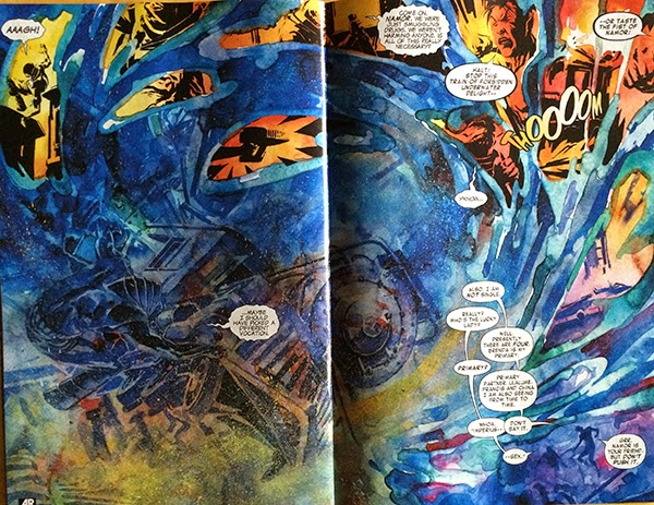
This double page spread is a great example of another page that uses layout to cell a non-conventional setting. This page, which takes place underwater, also refuses to conform to a standard page layout and instead flows around wildly like the crazy undersea currents the page depicts. Which makes the page feel, well aquatic. We the reader have to swim and contend with the wild wave action of the page to migrate through the key elements. Which again makes the layout feel distinctly like being under water and completely unlike normal terrestrial comics. This is another great example of a page that uses layout to transport us to another world and mindset.

BB:TWS #1 is a treasure trove of innovative storytelling worth a closer look. 

This post is by Michael Bround