With lettering by John Workman and Russ Wooton
I think one of the most under appreciated aspects of comics is the lettering, that secret art of placing word balloons in just such a way that everything effortlessly works. When done badly, dialogue doesn't follow a comprehensible order and is confusing, and artwork is trampled beneath inelegantly placed text balloons. When done well the dialogue is beautifully and logically arranged on the page in a way that relates to the artwork in an artful, organic way. (And when done perfectly, the placement of text can actually be an asset to help lead the reader through the page.) In this post I'm going to look at two books that have really great, but very different approaches to lettering.
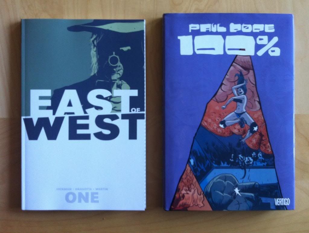
There will be some will *SPOILERS* for East of West: Volume One and 100%.

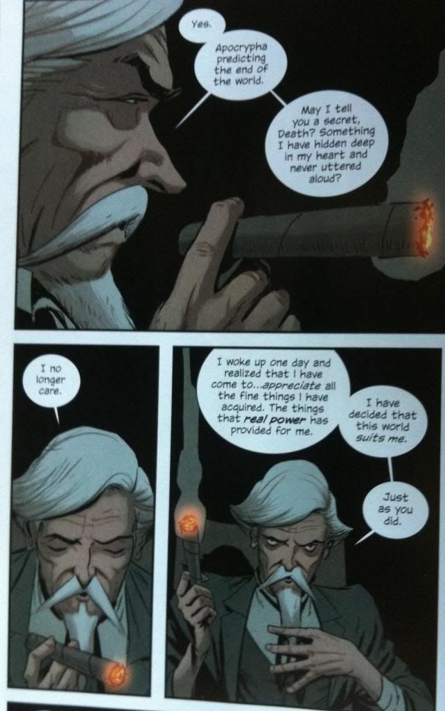
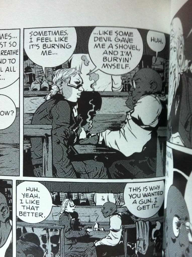
East of West, with lettering by Russ Wooton, has some really expert, really adroit examples of what I would call "conventional" lettering. Most speech bubbles have a single tail, and longer exposition is linked as a series of bubbles. The bubbles are elegant and interacts with the artwork in a really smart way. The two sequences I've picked above are particularly good as they do a great job of leading the eye around the page so that the facial acting in the artwork is encountered in just the right moment. This ensures that the emotional resonance of each word and moment is pitch perfect, which enhances the exposition portrayed and adds tremendous dramatic weight to this sequence. It's great.

The text in this sequence here does some really interesting guide work. For instance in the first panel, we see the man's face before seeing the text which sets the emotional tone. We then read through the dialogue before encountering the glowing tip of the cigar, and important symbol of terrestrial wealth and power throughout this conversation. In the next panel (well I skipped a panel, but the next displayed here) we read the text before seeing the man looking down at the cigar: we see the thought he no longer cares about spiritual things and then see the reason for it (earthly power totem). We then move into the next panel, see the cigar/totem held aloft like a sceptre/torch, and then proceed straight to the text where we read our way around the panel in a circle, eventually arriving back on the man's face as he looks up at who is addressing in challenge. The way the text keeps us from seeing his face until the end of the page, adds a lot of weight to that final glance. It's great comics.
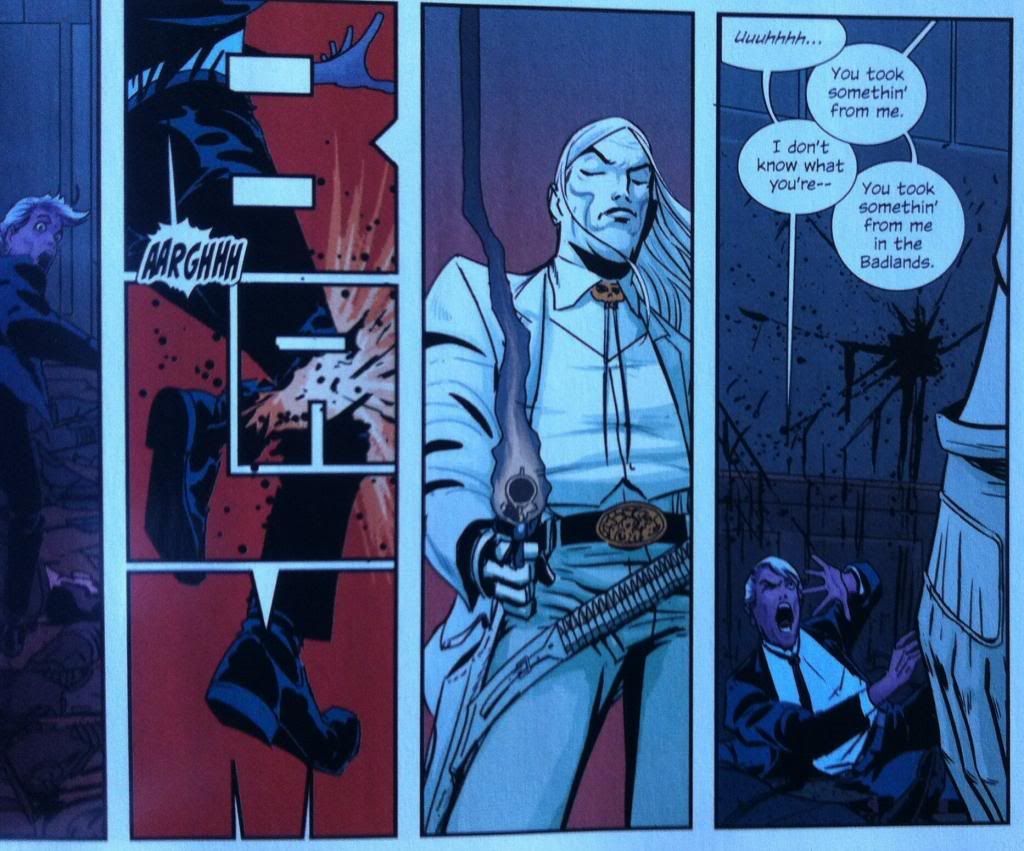
(This sequence here is less about good lettering and more about how much I love the "BLAM" pannel here. I love how the sounds of many words, show the shape of the action or sound. Like "drip", where the "dr" is evocative of water beading, the "i" catches the tiny moment of a drop falling, and the "p" sound catches the noise of a drop hitting a surface. "Blam" works in a similar way where the "Bla" catches the explosive noise, the "m" brings to mind the cavernous echo/silence that follows the report. The fact the "A" of "BLAM" is the point of impact is therefore a stroke of bloody genius. I love it.)
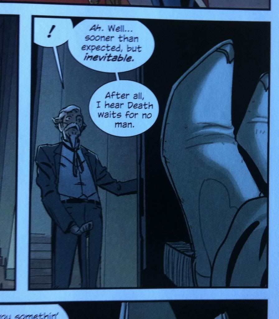
The one problem with conventional dialogue box placement, as pretty as it is, is that sometimes the image of the moment, and the text of the panel don't entirely match. This is an example from East of West this text/image disconnect. We enter this page, read the text, noting the surprise mark and then the transfer to the cool, unflappable dialogue of the character, BEFORE we see the shocked face of the character. The text precedes the face, takes us past the moment of surprise, and then dumps us back in the previous moment. It's not the best lettering in the comic (which is mostly really great!). But to a certain extent this kind of lettering backtracking is unavoidable, a consequence of panel limitations and script being packed in. It is, I think, an inherent risk of the standard lettering approach.
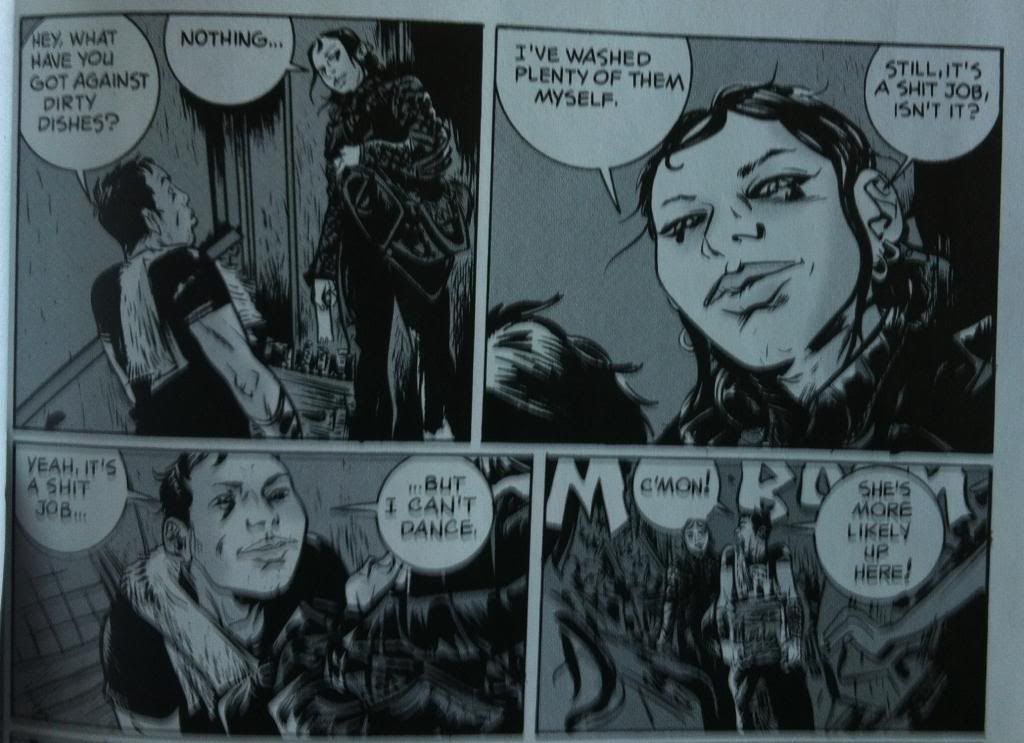
100% by Paul Pope with lettering by John Workman uses a different approach to lettering, and one that I don't see very often. Instead of building dialogue balloons carefully into the artwork with the standard approach, 100% almost always splits the dialogue so that characters are surrounded by their dialogue. We get to experience half the text, see the emotion, and then finish the text. What this does is embed the emotion of the moment right into the centre of the text: the face we see is the face of the whole dialogue moment. It's maybe a bit brute force at times, but it makes sure that the characters acting is always appropriate to the text. Which works really well for a character driven comic about living 100% in the moment. It's really cool comics, and maybe an approach that solves some of the problems of the standard lettering approach.
No comments:
Post a Comment