By Kieron Gillen, Jamie McKelvie, Mike Norton, Matt Wilson, and Clayton Cowles; Marvel Comics
Young Avengers is another great issue in the Young Avengers series. Issue #8 deals with our intrepid heroes tracking their mysterious foe through the multiverse. As such, the comic features a number of different dimensions each with its own distinct look and feel. And a lot of this distinction is due to subtly altering the colour palettes going from one world to the next. I think it is worth unpacking.
There will be *SPOILERS* for Young Avengers # 8 so please read the issue first before continuing.
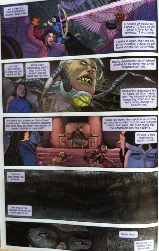
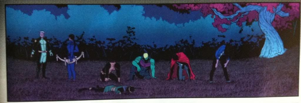
In total the Young Avengers visit 9 different dimensions. The first four (above) are shown only as glimpses and are demarcated mostly by their crazy contents. As such, they do not have established motifs (or if they do, it is difficult to pick out since each world is left too quickly to find trends.) The rest of the worlds have multiple panels and each have their own look, largely established through colours. (as all worlds are drawn in Jamie McKelvie and Mike Norton's particular, great style).
So for the five established dimensions, there seems to be the following colour motifs:
1: Earth-212, which is a kind of Super-Earth+, has a colour scheme close to the rest of the comic series but with a certain glowy-ness. As if everything was near a neon sign, or has an internal candle. This gives this dimension a warmth that is coupled to its relative safety as a place to visit.
2: This reality is a Dystopian-Kree world and it is a dimension of shades of grey, scribbled through with a mess of cross-hatches. Characters in the environment are also heavily shadowed, with their colours subtly muted. It's a place that looks as harsh as its depicted contents.
3: The Demiurge reality is kind of a magic dreamworld. It is dictated by a colour palette that diverges from nature: pinky-red and purpley-blue appear in places they should not, replacing foliage or the sky. It's surreal, and beautiful, and a little creepy, just like this dimension.
4: Mother's home dimension. It is harsh white open space, a place where the normal fabric and rules of comics, and therefore reality, do not apply. It's a surreal and scary place, stark and difficult to understand, much like Mother.
5: Hellish-looking-place. It has a, well, hellish quality. The background is governed by hot grey tones as far as the eye can see, while characters are illuminated by a bright, ubiquitous glow. Not a soft, warm one like the candley effect of Earth-212, but instead a fierce one, like being caught in sun-glare or standing too close to a fire. It's menacing, much like I think this reality is likely to be given cliff-hangers.
Varying colours like this between realities is a really straight forward, subtle way to create distinct and strange seeming places. Yet more evidence that colouring is so incredibly important to good comics.
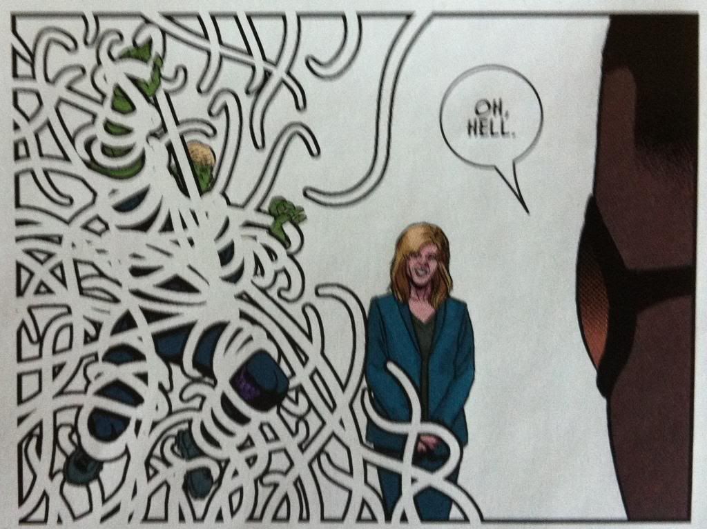
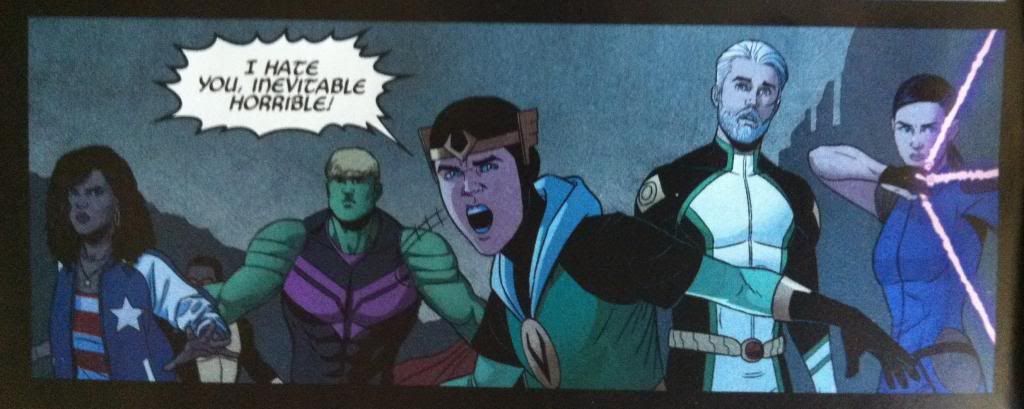
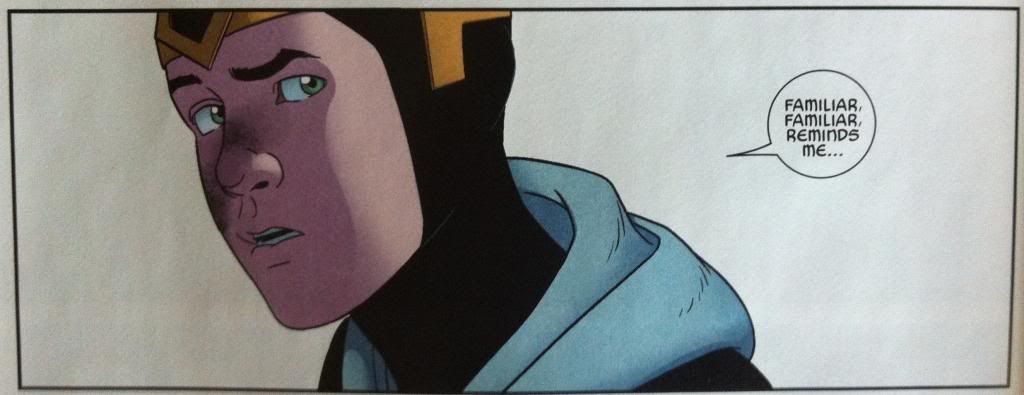
One of the more interesting aspects of Young Avengers is how the creative team represents super natural or magical elements and YA #8 has some really neat sequences. Specifically, the comic has panels where the frames of the panels themselves attack characters. Which is some pretty fourth-wall breaking, trippy stuff. This all occurs within Mother's Home dimension, and is a great visual way to display the power of Mother and her absolute mastery of her home reality. Hulkling and Prodigy are pretty screwed.
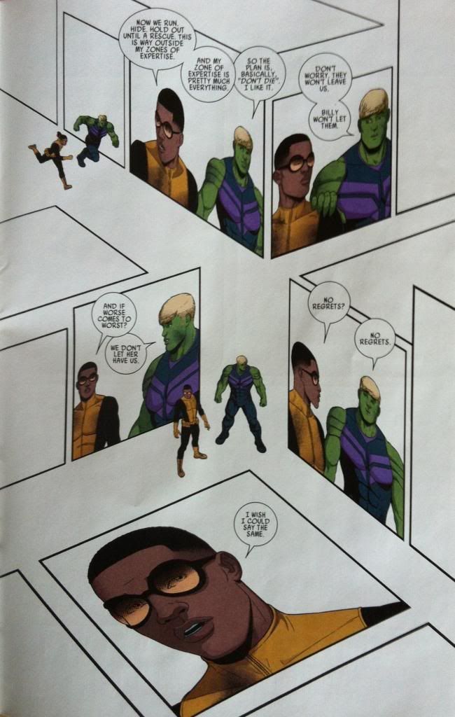
Speaking of which... this is the most experimental layout in Young Avengers #8. (I love the experimental layouts in YA's.) As usual, this crazy layout manages to perform a dual story telling and character/thematic duty. From a pure storytelling perspective, this page shows Hulkling and Prodigy running as they try to escape Mother as well as a conversation where the pair take stock of their situation in an interesting way. This page additionally continues to build just how weird (comic rule breaking) Mother's dimension is, and how daunting a prospect of overcoming Mother is while being trapped there. I think this layout also, by portraying Hulkling and Prodigy in proximity over and over again, while in the empty, bleak, surreal landscape, emphasizes how the two are alone with each other. It's just them versus Mother's crazy world. It's a great layout that schowcases our heroes predicament and tonally sets up the gasp-enducing final page reveal of the issue. It's great comics.
Previously:
Favouring The Young Avengers #7
No comments:
Post a Comment