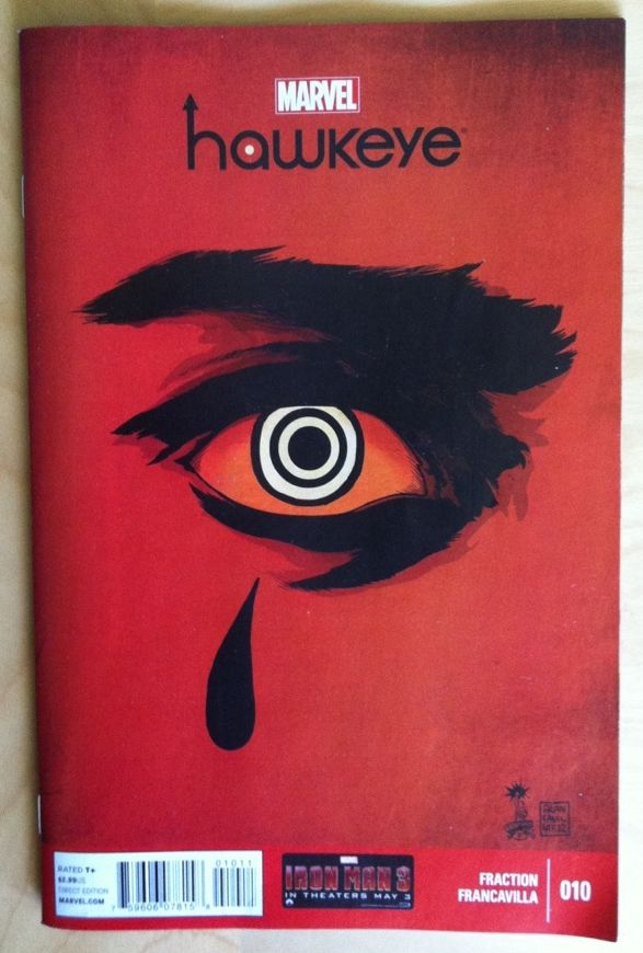
In this instalment of my continuing studies into what makes Hawkeye such an effortlessly effective read, I'm finally going to write something about colouring. Haweye #10 is the first issue of the series not coloured by regular tint-ist Matt Hollingsworth and is instead imbued with hue by the issues all-in-one artist Francesco Francavilla. And maybe it's a case of not missing something until it's gone... but this change in colourist, and the style of the shade-wizardry, has had a huge impact of in my experience with this comic.
To avoid *SPOILERS* I'm going to avoid talking about the plot in any detail, but suffice it so say that Hawkeye #10 focusses on a new villain, giving us context and background and making him loom so much more sinister than he might have without this issue. And, a lot of this is due to the brilliant nightmarish colouring of Francavilla. But I think, more than that, is the loss of normalcy that occurs when we lose the familiar style and colour palette of Hollingsworth on colours.
As I mentioned earlier, Matt Hollingsworth has done all of the colours in Hawkeye #1-9, which makes him the only artist on the book to contribute to every preceding issue. Due to the rapid-fire publishing schedule of Marvel a variety of artists have pencilled the interiors of Hawkeye including Javier Pulido, Steve Lieber, and Jesse Hamm along with series regular Daivd Aja. And yet, there has been a unified look to the comic. Now, part of this is that the rotating artists, aside from the Cartoony Hamm, all have a very... classic and cinematic look. But I think this unity of aesthetic is mostly dictated by the colours of Hollingsworth.
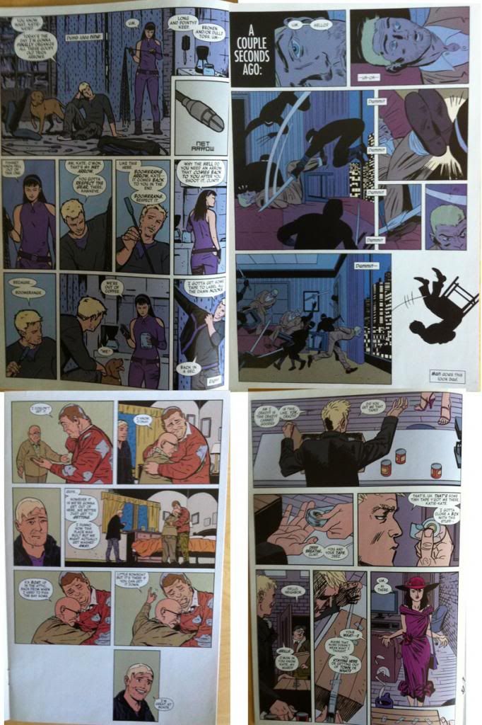
Here are four random pages, each drawn by a different Hawkeye artist, but coloured by Hollingsworth. (Clockwise: Aja, Pulido, Hamm and Lieber.) You'll notice that each have this beautiful flat colouring that features a purple-enhanced life-like palette. People are coloured like people, purple and occasionally a muted red are the main wardrobe colours, and the backgrounds are pleasant colours that lovingly compliment the featured purple. The effect is pure cool with an old world cinema classiness. For me this collection of colours is integral to Hawkeye feeling like itself: this is a key component of the visual identity of Hawkeye.
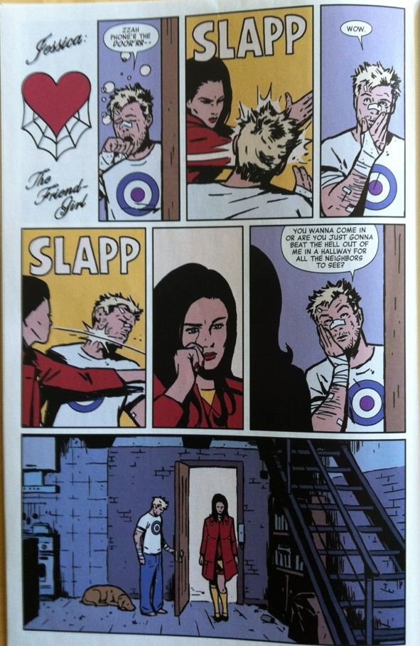
Hollingsworth's colour pallete is so integral, that even small deivations, such as the SLAPP frames from Hawkeye #9, with their bright yellow backgrounds, break the trend, stand out as weird, and therefore just pop off the page.
Hawkeye #10, has a completely different look and feel from the preceding issues of the comic. And that look and feeling is W-R-O-N-G. Everything about this issue feels askance and creepy and not like the Hawkeye we all love. (In a really smart, good and effective way!) And I think a lot of this is the colours that Francavilla uses.

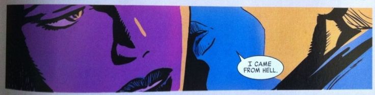
This issue uses two different colour palettes, one for the current narrative and one for flashbacks, and both are crazy. The present story is bright, fierce blues and purples that bleed over characters and subsume them. Flashback scenes are orange and fiery, lending them an agressive, surreal immediacy. The story swaps back and forth between fierce, bight cool colours, and explosive fiery ones, pulsating between two very unnatural colour palettes making everything feel like a psychedelic fever dream. It's an absolutely perfect match for the story and artwork.
And if you compare the colours Francavilla uses to the Hollingsworth colour palette above, you see Francavilla's colour choices are radically different. So radically different that Hawkeye #10 lacks that colour visual identity that's needed to make the comic feel like Hawkeye standard. Which takes the feeling of wrongness created by the fever colours and enhances it, sowing a feeling of discord: we were expecting to see our familiar Hawkeye and instead got something radically different, something beautiful and terrible and strange. It's great.
So Hwakeye #10 brings us a chilling new villain, and because of the masterful shift in colouring we are menaced and told the party is over.
No comments:
Post a Comment