I love purchasing collected editions of comics and displaying them as art objects. They're attractive, a visible expression of my interests, and a constantly present collection of some my favourite things. Also, when the Big Earthquake comes, I'll have a great collection of reading material during the daylight hours.
In the last post I talked about the idea that comic book spines are important in larger formats like tradepaperbacks or graphic novels because on a bookshelf the spine is the most visible part of the comic. I also used the Brian K Vaughan comics to show some examples of what I consider good and bad spine design.
This time I want to highlight some of the best and most interesting comic spines in my slowly growing comics library. These are the book spines that clearly show their designers understand how important a book spine is to a comic's on the shelf appearance. (And perhaps on the importance of standing out on a bookshelf from a retail perspective.)
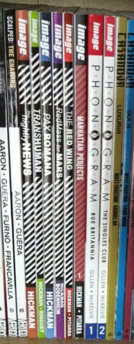
Jonathon Hickman comics: This one is less aesthetically pleasing and more manipulative and clever. Every Jonathon Hickman book has a striped pattern on the spine. When rendered in black and white it is EXTREMELY eye catching (particularly when shelved as a group). The human eye is wired to pay attention to black-white-black lines and the illusion of movement these give off out of some mammals-of-the-savannah evolutionary quirk. So this Hickman block of books is super eye catching. While not the prettiest design, it is uniquely Hickman and identifies his work. More importantly, these books do not get lost on the shelf. (By Jonathan Hickman & Nick Pitarra, JM Ringuet, Ryan Bodenheim: Reviews)
(From a retail perspective this approach might be even more brilliant: only his books have this stripy pattern and its associated attention nabbing effect. If we accept the premise that the point of an eye-catching cover is to get a consumer to pick up a book, then this eye-catching spine design might represent a retail advantage.)
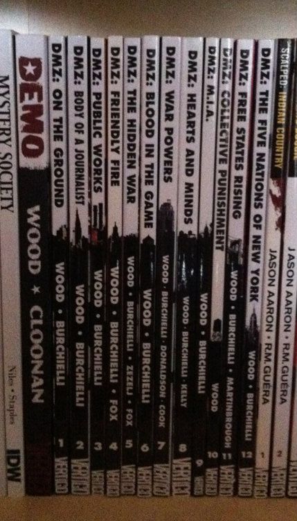
DMZ: This is one of the most clever and aesthetically appealing comic spine designs I've seen. Let me explain, DMZ is the story of a modern civil war fought between the US government and an insurgent movement. A key aspect of this story, and how it works, is the use of Manhattan Island as a war torn battlefield. It creates context for the story and serves to illustrate the horrors of modern warfare in a familiar setting. As such, a key character in DMZ is Manhattan itself. The spines of the DMZ comics are a visually pleasing design that is white behind the title writing and black behind the author text. Brilliantly, a New York landmark is included at the interface between the top and bottom half of the spine. When looking at an individual volume, it's a sharp design. When looking at the entire series, it creates a miniature and very recognizable New York skyline effect. It's clean, unifying, unique, and highlights a key aspect of DMZ. It's great. (By Brian Wood & Riccardo Burchielli, and others)
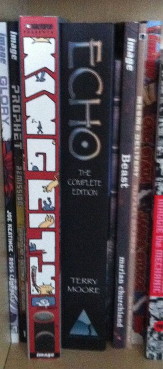
King City: This big, complete series trade shows off what you can do with the real estate of an extra wide collection. The letters that spell out King City, beyond being in an interesting and high catching graffiti-esque font, are also the frames of a tiny comic strips about a cat (presumably Earthling) stalking and dispatching a little cartoon man. It's silly, fun, really well thought out in this making-really-intelligent-use-of-space-and-storytelling kind of way, and pretty representative of the kind of comic King City is on the inside. The spine of King City is a better cover than a lot of covers. (By Brendan Graham: Review)
Also, just kind of as a case in point about the importance of interesting spine design, I've taken a picture of King City next to the extra-wide Echo The Complete Series collection. Echo actually has a pretty nice spine design: simple, has some pretty unique elements, and black always looks nice. But when you put it next to King City with its more creative use of space it kind of gets lost, doesn't it? (Echo by Terry Moore: Review)
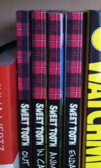
Sweet Tooth: Okay, this one isn't about a good spine design... this is a little thing I noticed. So the concept of Sweet Tooth's spine is pretty solid: clean black spine, unique Sweet Tooth font, and a nice plaid pattern on the top bit of the spine. It catches the quirkiness of the series, and because a red plaid shirt is intrinsically tied to the design of title character Gus, it really catches the feel of the series. Trouble is, I think a mistake was made at some point during the design process. If we zoom in on the plaid pattern along the top you can see the plaid checker alternates between Volumes 1 and 2, but then doesn't ever change again. So instead of getting the checker pattern of a plaid shirt across the series (Vol. 1 and 3 matching and complement the opposite pattern on 2 and 4)... we get mismatched, unconnected plaid colours. Which all makes it feel like a great design that was compromised by a mistake or neglect. Hopefully it gets fixed on a future print? (By Jeff Lemire: Review)
In my opinion these are some of the better and more interesting comic designs out there. They manage to look good, make a statement about their series, and stand out from their competition. I certainly appreciate the extra effort.
No comments:
Post a Comment